
The Language of Color:
Colors communicate without uttering a word. Each hue carries its own unique set of associations and conveys specific emotions. Understanding the language of color allows designers to strategically use palettes to create desired effects and resonate with their target audience.
Red: Often associated with passion, energy, and urgency, red can evoke strong emotions and grab attention. It’s commonly used to convey excitement or create a sense of urgency.
Blue: Representing calm, trust, and reliability, blue is a popular choice for brands aiming to establish a sense of professionalism and stability. Lighter blues can evoke a tranquil atmosphere, while darker blues convey a more serious tone.
Yellow: Symbolizing optimism and warmth, yellow is a cheerful and attention-grabbing color. It’s often used to convey positivity and energy, making it a common choice in branding and design.
Green: Associated with nature, growth, and freshness, green is often used to create a sense of balance and harmony. It can evoke feelings of calm and relaxation.
Purple: Conveying a sense of luxury, creativity, and mystery, purple is often associated with sophistication. It can be used to create a sense of opulence and elegance in design.
Orange: Combining the energy of red and the cheerfulness of yellow, orange is an attention-grabbing color that conveys warmth and enthusiasm. It’s often used to create a sense of friendliness and vibrancy.
Black and White: Classic and timeless, black signifies sophistication, elegance, and formality, while white conveys simplicity, purity, and cleanliness. The combination of black and white can create a striking and high-contrast effect.
Cultural Influences:
Color Harmony and Contrast:
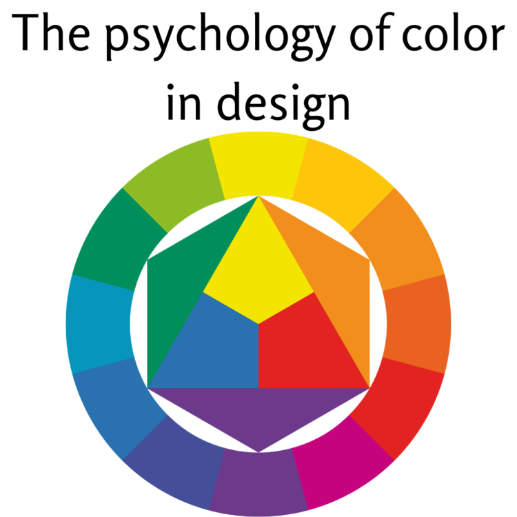
Creating visually appealing designs involves understanding principles of color harmony and contrast. Complementary colors (opposite on the color wheel) can create vibrant and dynamic designs, while analogous colors (next to each other on the color wheel) provide a sense of unity and cohesion.
Monochromatic: Using variations in lightness and saturation of a single color can create a harmonious and soothing design.
Triadic: Choosing three evenly spaced colors on the color wheel can create a balanced and visually appealing design.
Split-Complementary: Combining a base color with the two adjacent to its complementary color creates a color scheme that is both colorful and balanced.


No Comments
Leave Comment